Voronoi-Based Voter Assignment
Better Voter Protection Prioritization (Maricopa Example)
Around 60% of Arizonans (2 million voters) live in Maricopa County, which was served by 256 Vote Centers in the 2024 Election.

Why I (Re)built This Dashboard
- Any voter can vote at any polling polling place
Most of Arizona’s 15 Counties, (including its most-populous, Maricopa) use a Vote Center model that lets voters cast ballots at any site in their county of residence, without regard to precinct boundaries. - Precinct-distance from Vote Center falls short
The previous way Vote Centers were prioritized was by assigning ALL of a precinct’s voters to the closest votecenter based on that precinct’s centroid point. This left some polling places overserved and others ignored. - True “nearest” mapping
We needed a way to see which vote centers served the most voters, based on where they actually live, rather than their precinct residence.
Voronoi-Based Service Areas
By generating Voronoi polygons around all 256 vote-center points and then spatially joining the latitude and longitude of 2 million voters by address, we quickly assign each voter to their true nearest site (without running 2 million × 256 distance checks)
Exploring the Map
Most Populous Precinct - Roeser Precinct
To fit within Tableau Public’s mark‐count limit, each point on the map represents ~20 voters.
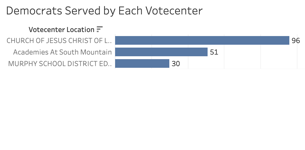
Take the most populous precinct in the county, Roeser Precinct. In the previous model, all of its voters would have been assigned to the Church of Latter Day Saints. But as you can see, voters in Roeser precinct are split pretty significantly among three nearby vote centers, none of which lie within the precinct itself.
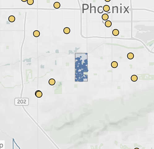
Roeser Precinct
Roeser Precinct’s Closest Vote Centers split
Extent of voter split between Vote Centers
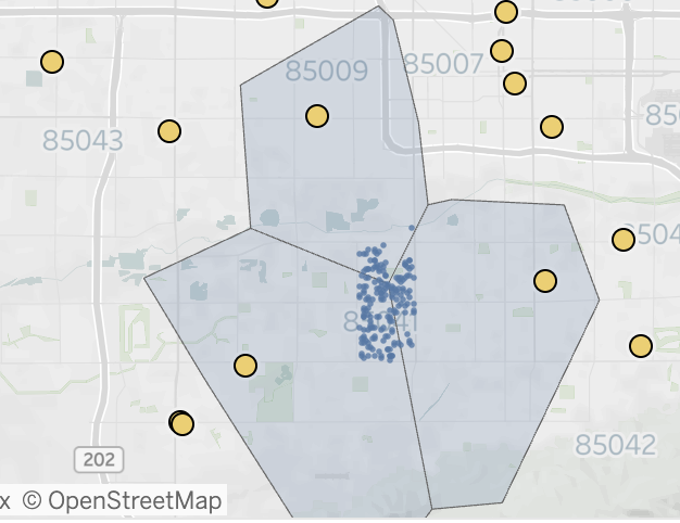
Most Populous Vote Center - Academies at South Mountain
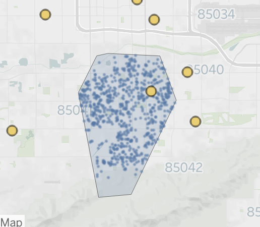
The Academies at South Mountain center serves nearly five times more voters than the population of the largest single precinct. But a centroid‐based method could leave it with zero assigned precincts (if no centroid falls closest) or bundle entire precincts arbitrarily, obscuring the true spread of voters it actually serves.
Impact & Takeaways
- Resource reallocation
Instead of funneling volunteers and legal teams based on precinct proximity, the VoPro team can now focus on the centers actually serving the most people. And by assigning each voter to a Vote Center, we can prioritize the demographic groups we are targeting or serving certain volunteers with language skills to the appropriate places. - Faster, cheaper, scalable
a voronoi spatial join to the lat/longs of only the voters that live within that shape beats millions of distance queries or expensive API calls.
Details & Methodology
- Data workaround
Because the Arizona voter file is not publicly availalbe, this tableau dashboard demonstration uses a parcel point workaround: Maricopa County parcel points were randomly labeled Democrat or Republican based on each precinct’s 2024 vote share. Parcel points are from Maricopa GIS Open Data, and the precinct-level results come from the NYT 2024 GitHub repository.